Volvo Retailer Selector project X global markets
The Volvo retailer selector flow and customer experience varied from over 30 markets, in behaviour, design and conversion. This created a lack of trust amongst the retailers and users and a disjointed brand visually with lower targets.
Services & logistics: delivery in 1.5 months in 52 markets including EU, Asia-Pac, US, LATAM, Middle East markets for a global rollout
My role: Lead product designer

- Service mapping, customer flows
- UX, UI design
- Prototyping
- User research, QA testing
- Components: Volvo Web design system
- Stakeholder management
Tools and resource
- Figma, Storybook
- Notion, Atlassian suite, Miro
- Workshops remote & in person
- Retailer research in Sweden
- A11y tools, Launch Darkly
- Usertesting.com
Team & stakeholders

- UX, PM, EM: Trio model
- Front end x2
- Back end x1
- Content ad-hoc
- .com domain product teams
- Retail cluster leadership
☕️ How we started
Multiple product teams identified the need to standardise retailer information across web. After a detailed analysis and competitive benchmarking, we redesigned the Retailer Locator to strengthen online retail capabilities and resolve user-journey and cross alignment issues.
WORKSHOPS/ STAKE HOLDER MAPPING / PROJECT PLANNING / ROADMAPS / DESIGN SYSTEM CONTRIBUTIONS/ A11Y
🚀 What we did
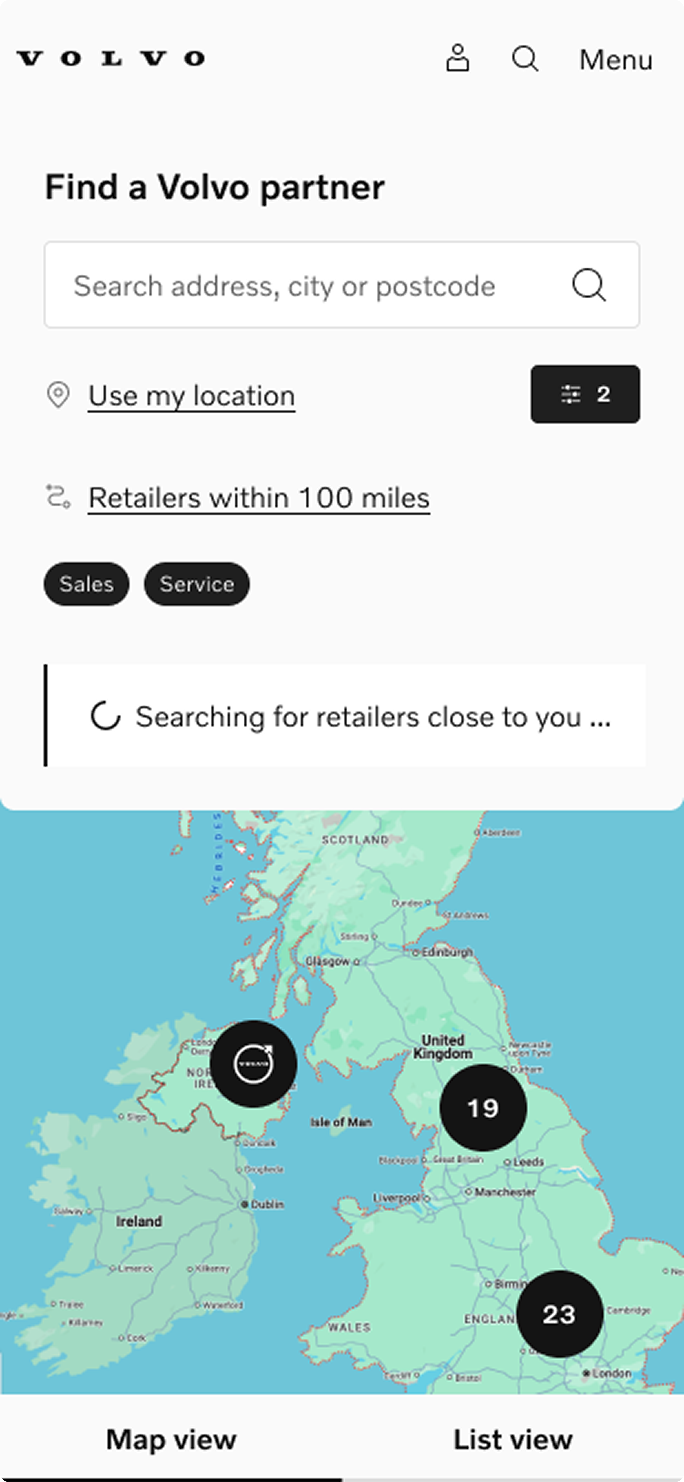
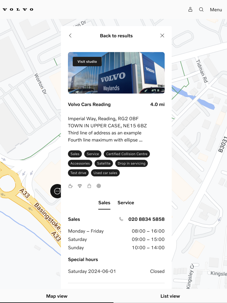
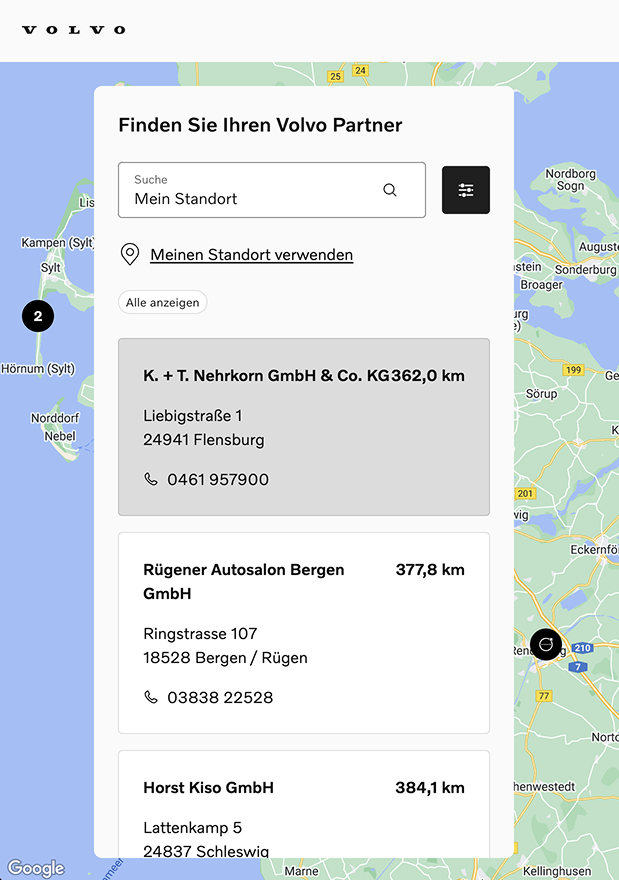
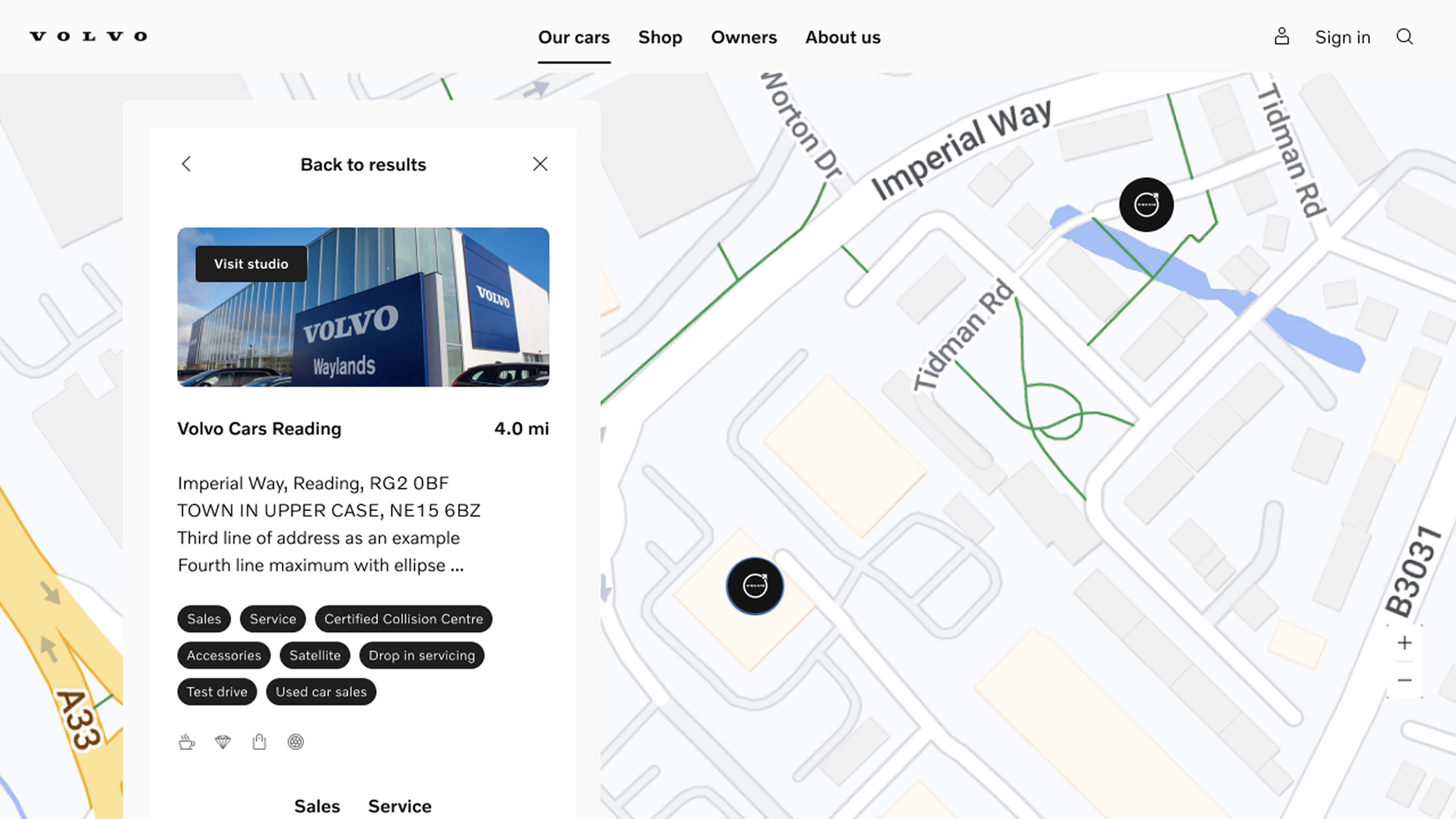
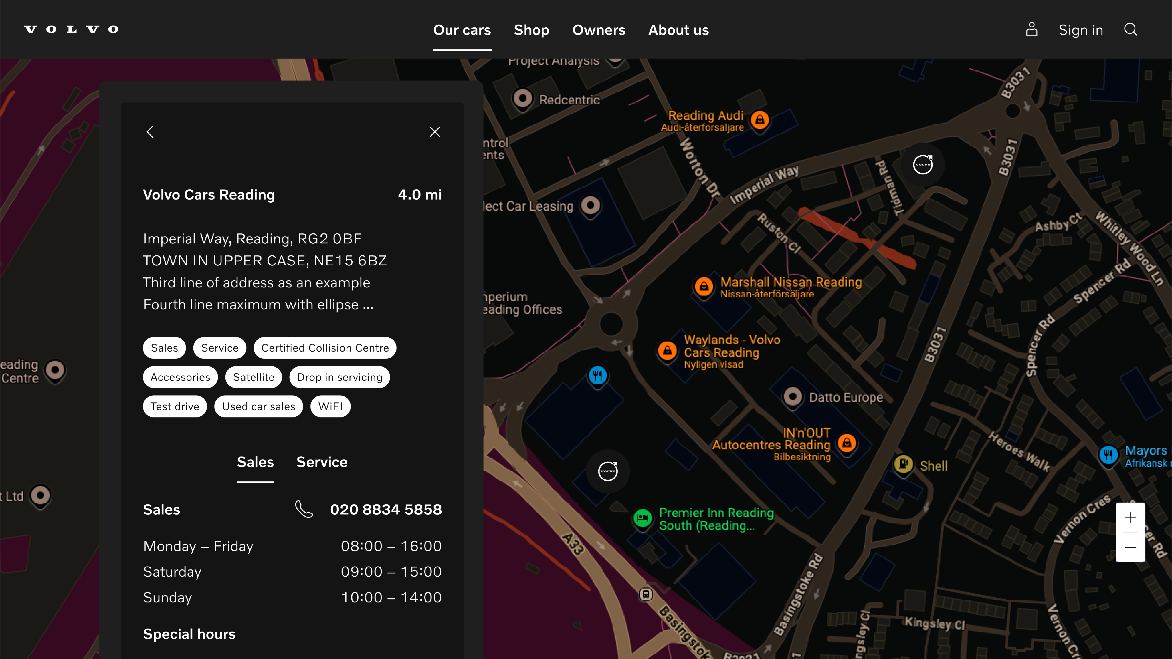
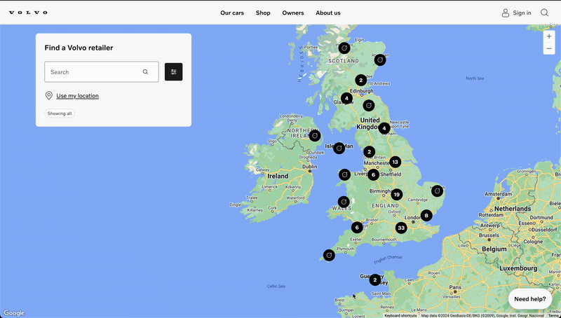
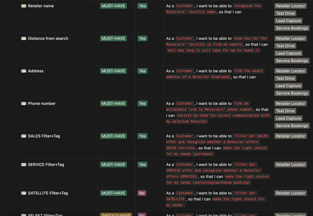
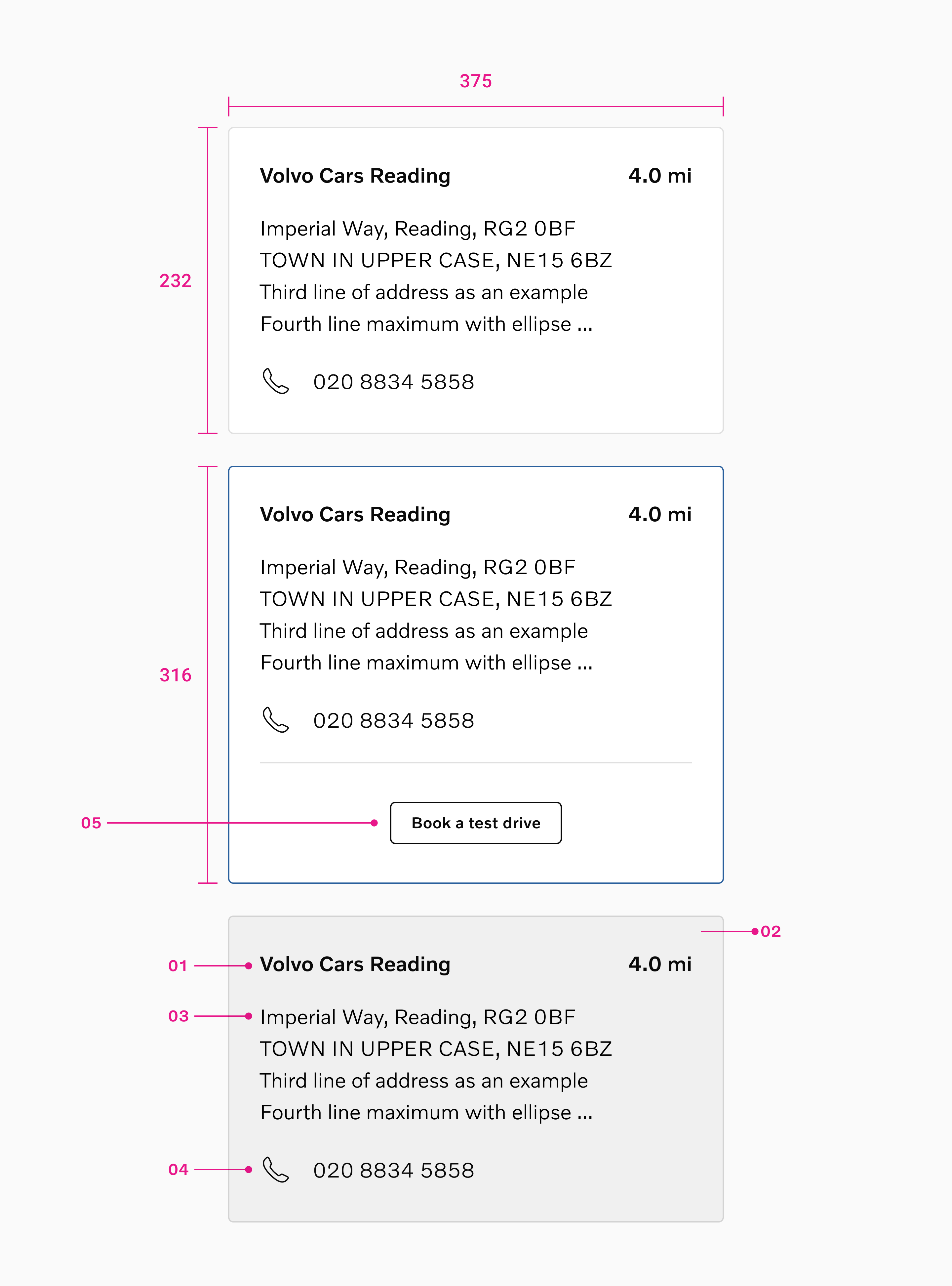
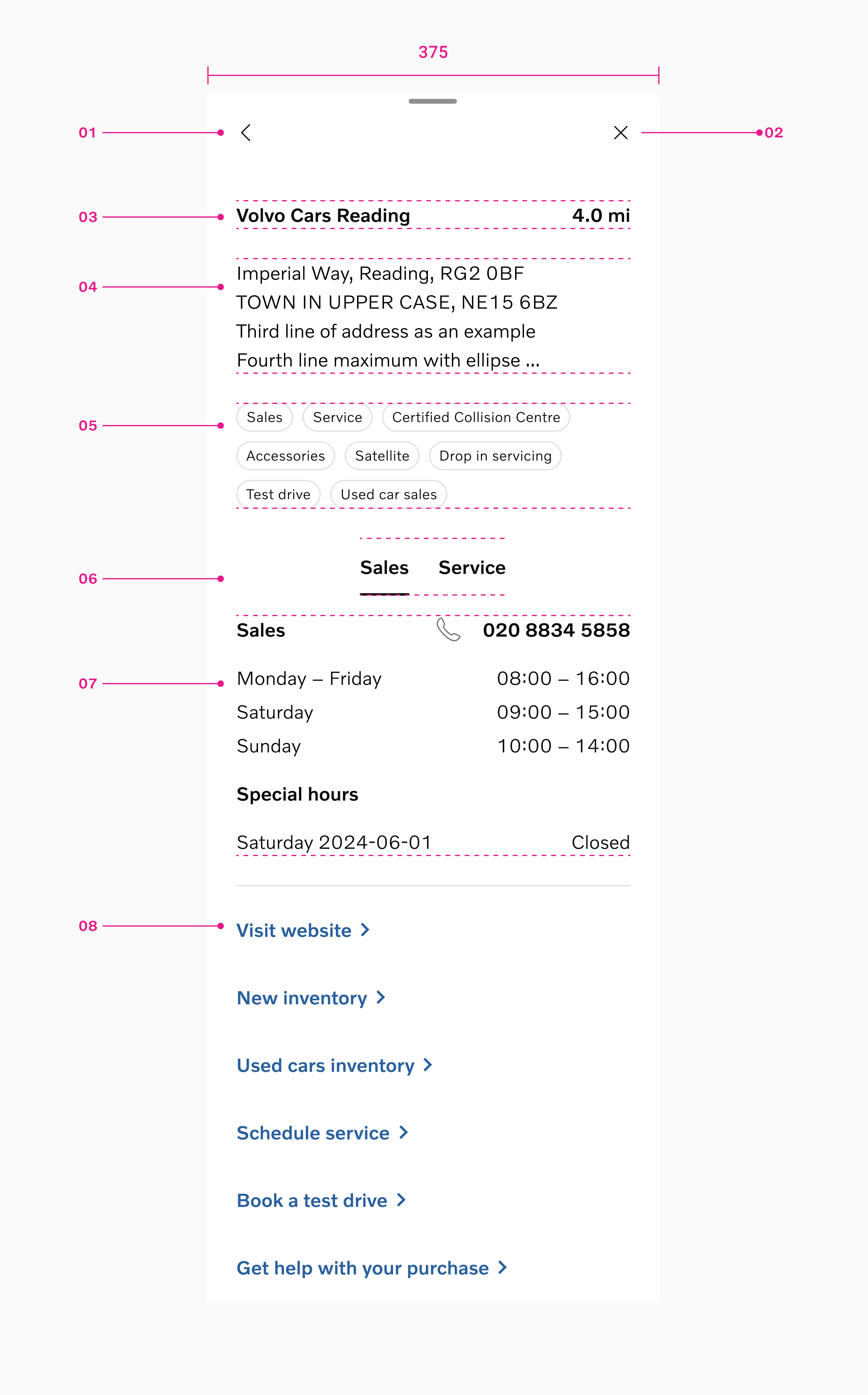
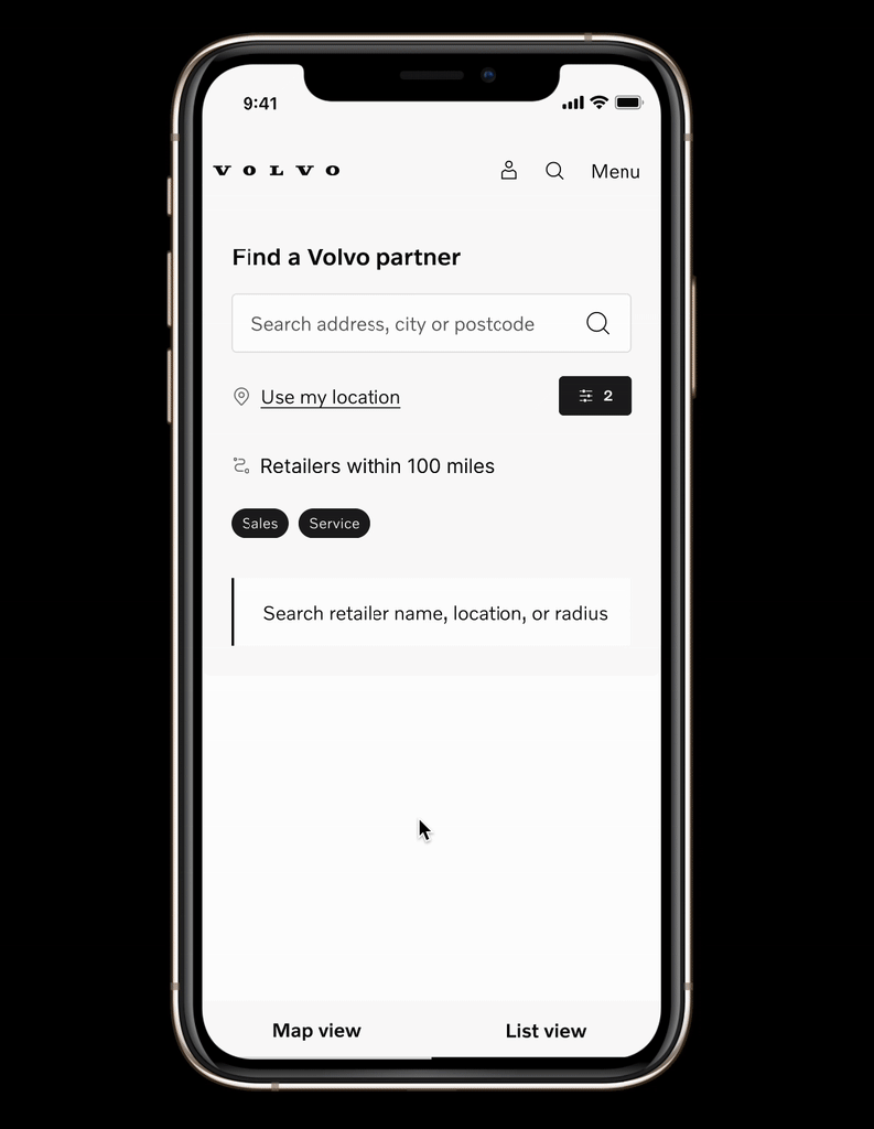
The new Retailer Locator features an interactive map of all market retailers, supporting location-based search for roughly 140,000 monthly users. Results are ranked by proximity and key business rules. Each retailer profile includes name, distance, address, phone numbers, and links: Website, New/Used Inventory, Test Drive, Lead Capture, and Service Booking.Impact
The project launched successfully across global markets and produced great results in driving user engagement, enquiries made and calls to retailers to book their next test drive, a service or make conversations become easier.
The UX/UI optimisations were designed to strengthen the omni-channel experience by making it easier for users to identify the right retailer and ultimately drive more qualified foot traffic to physical points of sale.
1st month post launch
⚡️ 161,873 users
Site sessions
🗺️ 10-25 %
Site visits and flow completion
🚀 10-20 %
Net promoter score
😃 NPS +25-30
Pre owned clicks
✅ +48%
Schedule service clicks
✅ +7 %
Book a test drive clicks
✅ +39 %
Quote clicks
✅ +27 %
Discovery and kick off
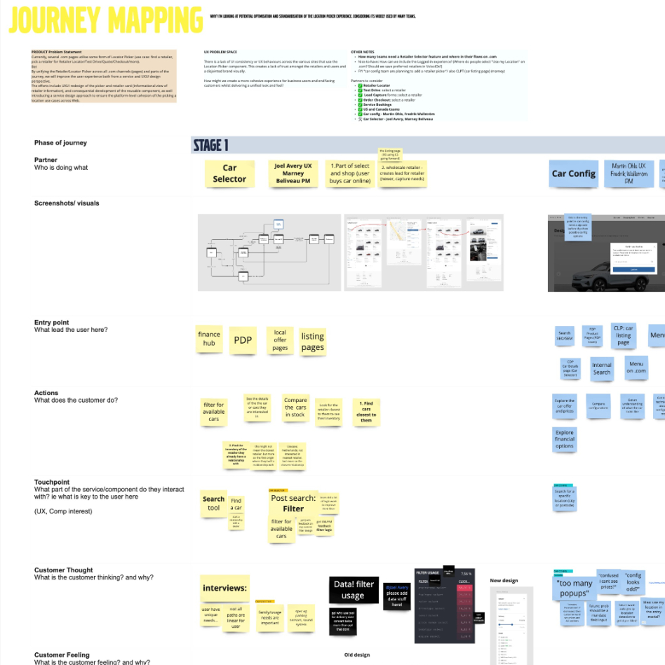
We did a cross cluster service mapping series to understand all the interaction points, missed opportunities, loss of data points and build consensus with the teams on the high value and build requirements.
Features, priorities, descoping
The team focused on creating the best in class solutions for users, including analysing and mapping high value features VS high effort features VS time x cost.
I led lean business canvas solution workshops to identify the key user needs, the company goals and ideal scenarios.
The difficulties faced including technical architecture origin or dependancy on various teams. we worked together to prioritise critical features and descope others.
The foundation for upcoming development increments further streamlined the opportunities for lead generation with Retailer Locator as an entry point which was key.
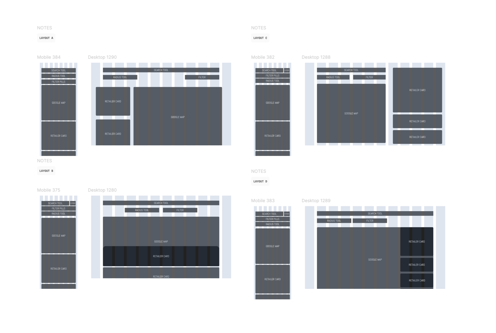
Wireframing, prototyping, user testing
Multiple teams were building similar features independently, creating fragmented solutions and limiting our visibility into usage—especially important as the team manage the Google Maps invoice. Without shared insights, we couldn’t optimise performance or control costs. By consolidating these efforts into a single, unified solution, we can improve cost efficiency, streamline development and maintenance across teams, and ensure alignment with a cohesive design system while still allowing the flexibility needed for team-specific features.
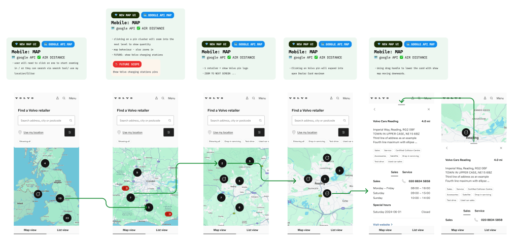
We ran multiple rounds of rapid design and prototyping to validate the new flows and identify which concepts delivered the strongest engagement and usability.
✅ Usertesting.com: unmoderated user journey testing with participants from 🇺🇸 🇩🇪 🇬🇧 🇸🇪
✅ LaunchDarkly: A/B testing on card variants with metrics – on volvo.comThis key flow design and component tested well with 100% flow completion rate and some iteration improvements on the pill UI affordance. 7 unbiased participants and 7 internal participants that worked closely with Volvo retailers in Sweden.
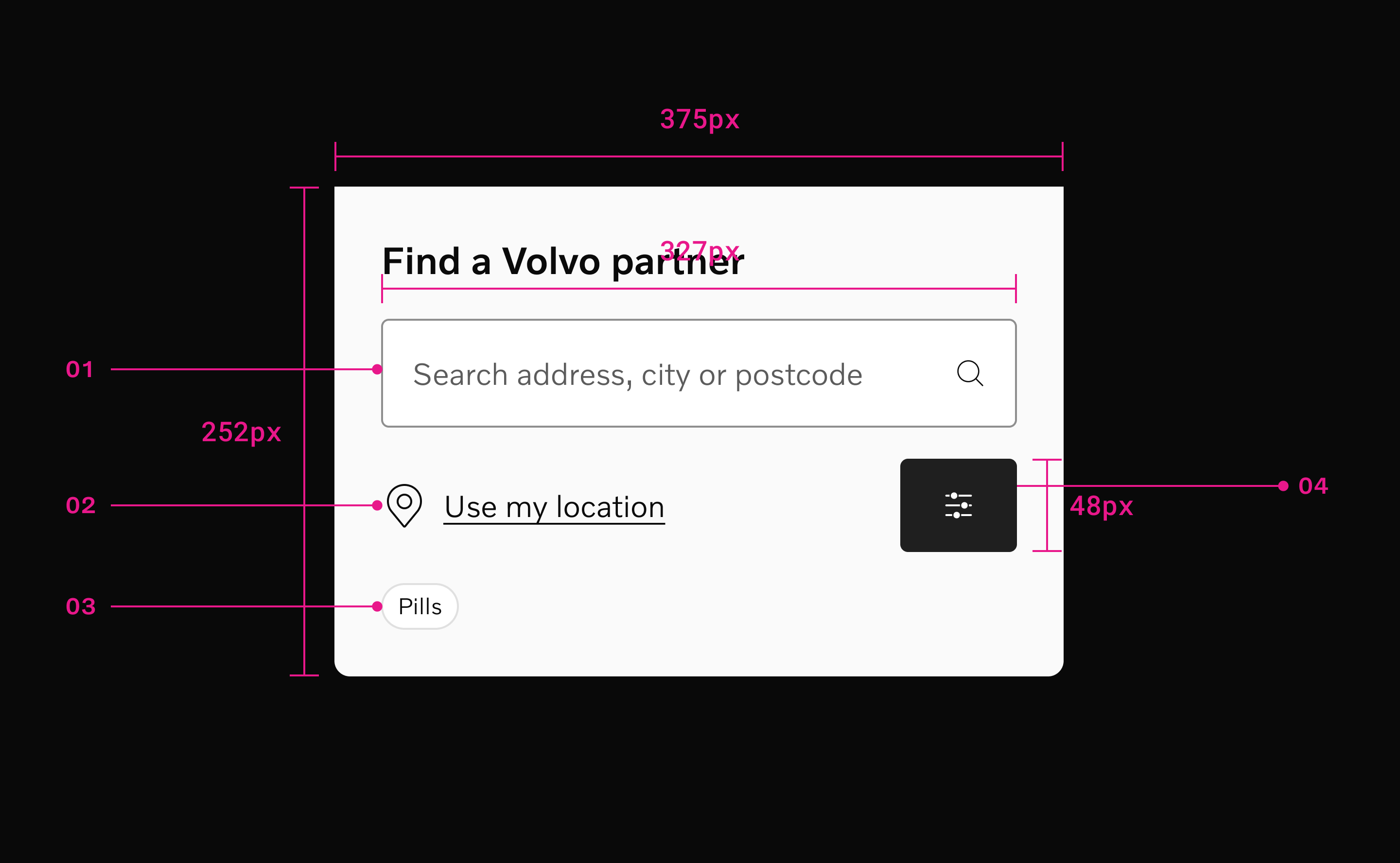
I created responsive designs across all key breakpoints to ensure a consistent experience on every device.
Restrictions include: design system language on pill motion interaction and colour variations. These are noted for backlog phase 2 stage.
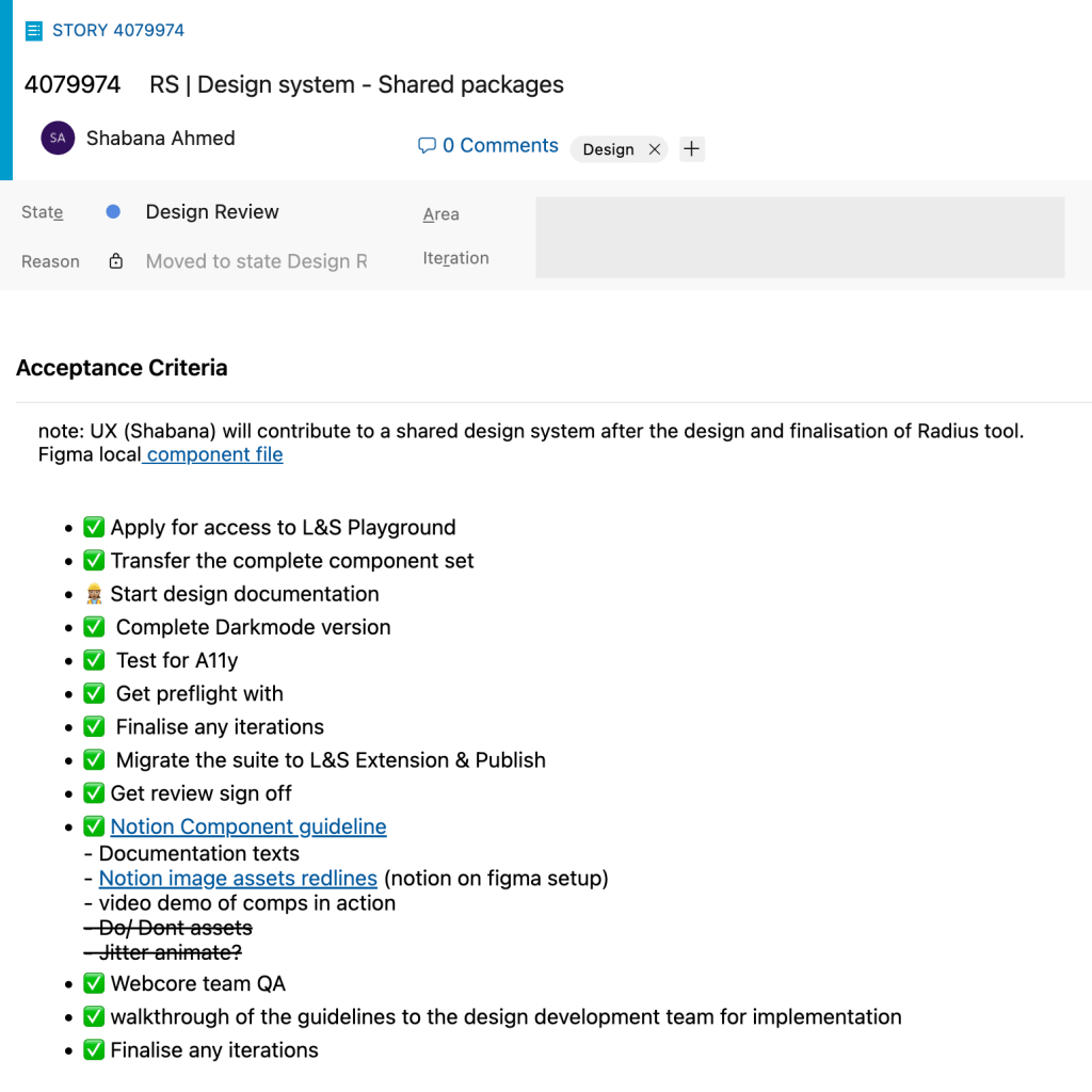
Hi fidelity | engineering handover | live components
New components were created in order to fulfil a complete user experience across the Volvo .com sites. The first dark mode version was also designed in time for the project launch, all high fidelity screens compliant with A11y standards for web.
We worked with a localisation tool to create solutions for global languages including right to left format.